ServGlobal is a premier enterprise master data management company that specializes in designing and implementing certified SAP MDG Add-ons & Accelerators.
ServGlobal needed a bold new identity that reflected its evolution into a leader in enterprise data solutions. The brand lacked consistency and recognition across digital and physical touchpoints, and the message didn’t fully capture its innovation, scale, or global ambition.
The Creative Path We Took
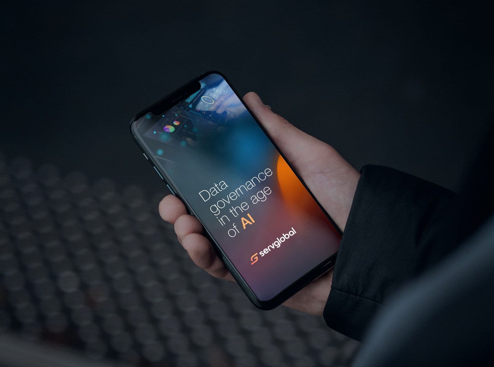
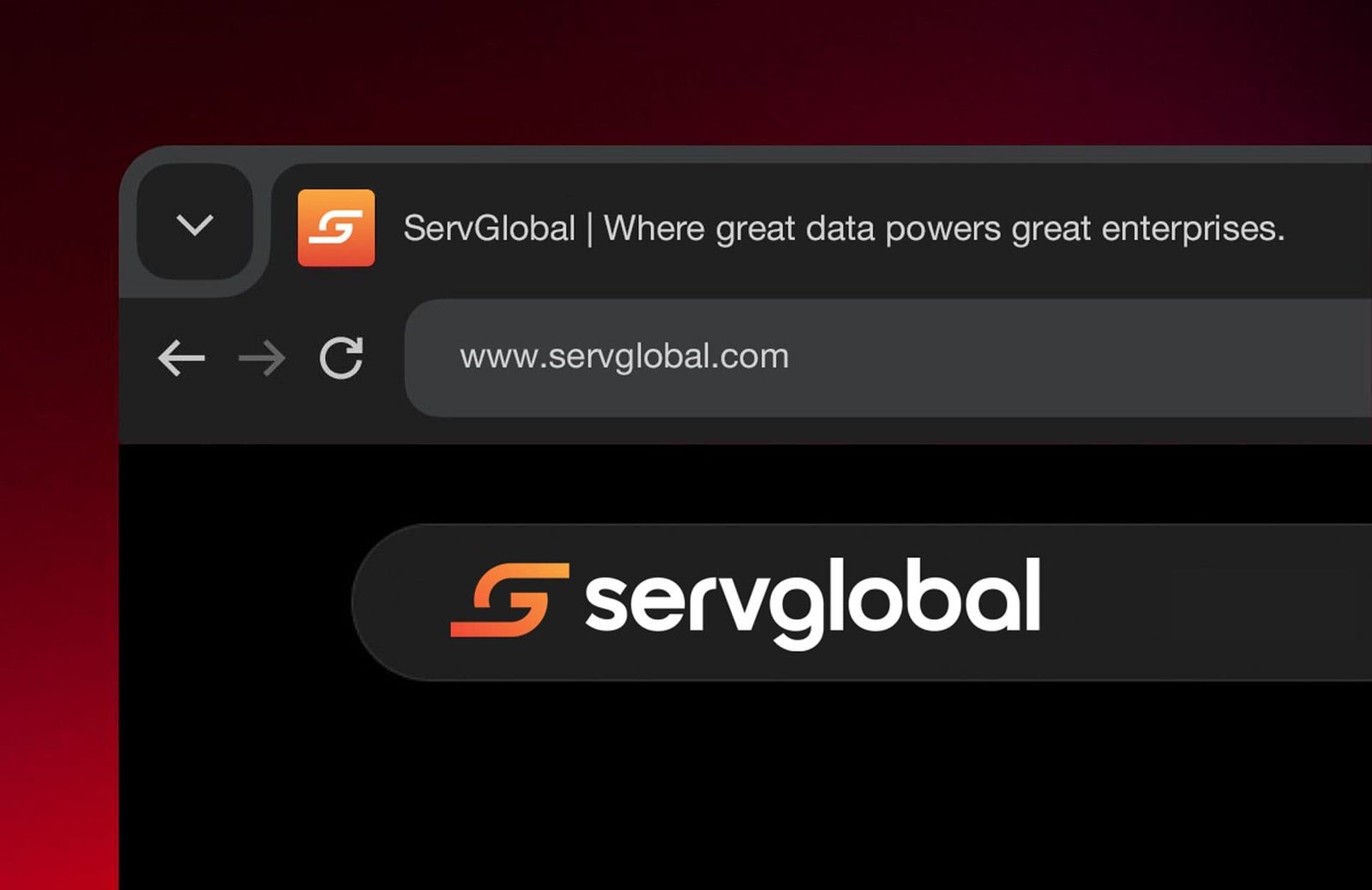
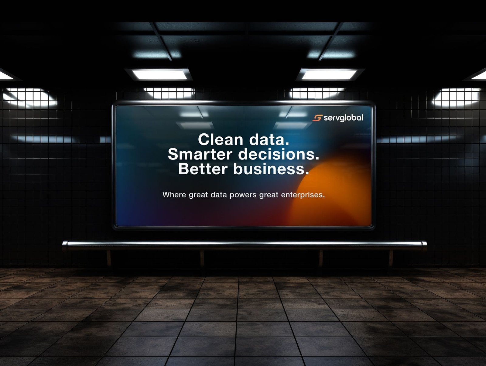
We reimagined ServGlobal’s brand from the ground up—starting with a new logo that integrates a stylized “S” and a hidden “G” to reflect seamless service and global reach. The warm gradient signals energy and transformation, while the entire identity is rooted in clarity, momentum, and enterprise credibility.
Interesting facts
in development
In rebranding ServGlobal, we designed an identity system that balances simplicity with sophistication. The stylized “S” subtly integrates a “G” and an arrow—symbolizing global mastery and momentum. From gradients to UX patterns, every choice reflects ServGlobal’s mission to accelerate enterprise data transformation with clarity and confidence.
Results of the project
User Engagement
Post-launch, ServGlobal saw increased brand recall and deeper engagement across LinkedIn and its digital touchpoints—fueled by a streamlined brand message and unified visual identity.
Business Confidence
The refreshed identity enhanced ServGlobal’s credibility in B2B conversations, helping the brand better communicate its strengths in simplifying SAP MDG implementations.
Brand Recognition
The distinct “S” and “G” mark, paired with a vibrant yet professional palette, established ServGlobal as a recognizable name in the enterprise data space.
Strategic Alignment
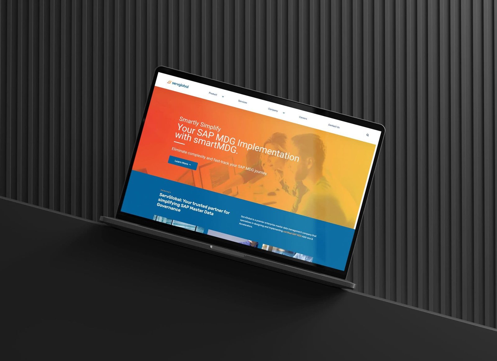
The website structure and messaging now reflect ServGlobal’s value proposition—faster, no-code, lifecycle-based MDG acceleration—helping prospects navigate offerings with clarity.